Muhan design

Siemens Dishwasher – Platform-Based Design for a Complete Product Family
西门子洗碗机 | 全新产品平台设计
This project marks a major strategic development in Siemens Home Appliances—creating a unified product platform capable of supporting a wide range of dishwasher models, including different installation types, sizes, and value segments. The design had to balance brand identity with functional flexibility, ensuring high performance and premium aesthetics across all models. In 2021, five models from this platform collectively received ten international design awards (iF and Red Dot), making it one of Siemens’ most recognized and impactful design programs.
本项目是西门子家电近年最具战略意义的产品平台开发之一,旨在以统一的技术基础支撑不同安装类型、尺寸规格与价格梯度的多款洗碗机产品。
设计不仅需要呈现品牌一贯的高品质视觉印象,还需在结构、交互与用材层面满足不同消费者的日常使用需求。
最终,在2021年,该平台上的五款产品共同获得了10项国际设计大奖(iF与Red Dot),体现出这一平台设计在全球市场的竞争力和专业认可。


Enhancing Everyday Interaction Through Design
This project marks a major strategic development in Siemens Home Appliances—creating a unified product platform capable of supporting a wide range of dishwasher models, including different installation types, sizes, and value segments. The design had to balance brand identity with functional flexibility, ensuring high performance and premium aesthetics across all models. In 2021, five models from this platform collectively received ten international design awards (iF and Red Dot), making it one of Siemens’ most recognized and impactful design programs.
从细节优化体验
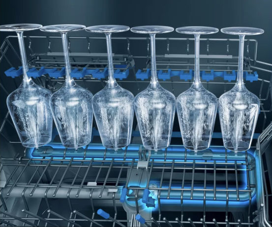
在此次设计中,我们也特别关注了某些易被忽略的高端使用场景,比如红酒杯等易碎器皿的清洗。为此,在内部设置了柔性硅胶缓冲区,并结合精准的喷嘴角度,为这些特殊餐具提供了安全、稳定且高效的清洁体验。
此外,考虑到洗碗机内部长期处于高温高湿、接触化学清洁剂的环境,结构材料的选择至关重要。我们通过优化截面几何形态减少水流滞留面,提升餐具干燥效率;同时选用不易吸热的材料,避免能源损耗,这些微小的优化都直接提升了产品的性能。

Lighting as Brand Language
Lighting in Siemens products is not just about functionality—it plays a critical role in brand recognition. All visible light sources, from button backlighting to interior spotlights, were tuned to deliver a consistent “Siemens Blue.” Achieving this required extensive testing of diffusion layers, LED properties, and plastic translucency in collaboration with material labs and suppliers.
光的语言:识别性与一致性
在西门子的设计语言中,光不仅具有功能性,更是一种品牌识别方式。从控制面板背光、状态指示灯,到舱内照明,每一处都必须传达统一的“Siemens Blue”。为此,我们与材料实验室和供应商密切合作,对扩散膜、LED参数和ABS塑料外壳的透光性进行了反复测试,确保不同零部件下都能实现色温、亮度与扩散感的一致

Iconography and Interaction Clarity
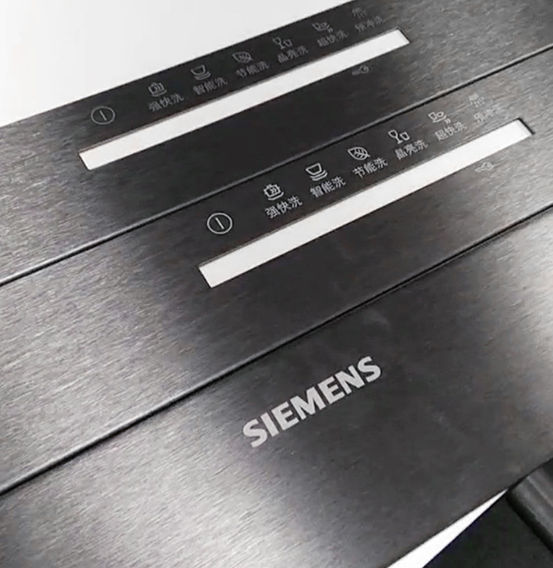
Icon systems are an often-overlooked but essential part of user experience. In this project, I designed and validated a comprehensive set of functional icons, ensuring that their appearance, positioning, and tactile feedback provided intuitive guidance, regardless of material or surface finish.
图标系统设计与用户指引
洗碗机的功能日益丰富,而图标设计作为用户与产品之间的直接界面,必须清晰、直观并具有识别性。在该平台中,我负责成套图标系统的开发,并对其在不同材质与表面上的印刷效果进行了测试与优化,确保其在视觉层级、功能反馈和触感一致性方面达成预期标准。

Platform Thinking: Consistency with Flexibility
Although built on a shared foundation, each of the 13 final products was uniquely optimized for its market and user context. Structural layouts, interaction mechanisms, and material applications were carefully adapted without compromising brand coherence. The core design challenge was embedding flexibility within a standardized framework— delivering both efficiency in production and precision in user experience. This project not only established a strong visual and structural identity for Siemens dishwashers but also laid the groundwork for scalable, future-proof product evolution.
平台化设计方法的探索
这个平台最终落地了13款不同型号的产品,但它从不是简单的模块拼接或外观复用。每一款产品在结构布局、交互细节与材料策略上都进行了本地化适配与精度调整。如何在品牌一致性与市场多样化之间取得平衡,是这个项目的最大挑战之一。我们希望通过这一平台,为用户传递稳定可靠的西门子体验,也为品牌建立一个可持续演进、适应未来需求的设计体系。


