Muhan design

Scroll-Based Interactive Module
ZEISS Lens ingredient
滚动触发交互模块 - 蔡司镜片配方
To better communicate the multiple benefits of ZEISS lenses, I designed a scroll-triggered interactive module for their B2C site. The module combines animations, visual hierarchy, and guided navigation to deliver an engaging and informative experience.
Due to its distinct visual style, the module was later upgraded from HTML to an AEM component, making it reusable across business units and global markets.
为了更具沉浸感地呈现蔡司镜片的多重优势,我为其B2C官网设计了一套基于滚动触发的交互模块。该模块通过动画、图文节奏与导航体验的整合,以动态方式强化用户对蔡司镜片价值的理解与记忆。
由于此模块为蔡司带来了前所未有的视觉体验,因此被要求从HTML原型升级为AEM组件,便于其他业务板块与应用场景中的高效复用。
Key Challenges
-
Balancing rich animation with performance across devices
-
Designing flexible, no-code content management
-
Ensuring consistent UX across screen sizes
-
Providing developer-friendly handoff for global reuse
-
Supporting graceful fallback for low-tech environments
挑战
-
滚动动画的节奏控制:确保动态内容既具有表现力,又不干扰阅读节奏。
-
模块内容的灵活配置:实现无需编码即可调整内容结构与动画表现。
-
分页导航与滚动体验的统一:兼顾自由滚动与定向跳转的导航逻辑。
-
响应式动效适配:为各类终端设备分别设计动效结构与交互方式。
-
跨平台重用与AEM接入:设计结构需兼容AEM组件化系统,支持多业务复用。
-
静态Fallback设计:保证即使脚本被禁用,内容仍能完整展现。

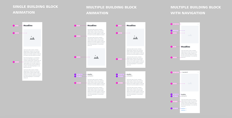
Interaction Design & Flexibility
The module uses keyframe-based scroll animation to highlight each lens benefit with visual impact, while ensuring a smooth browsing flow. To support flexible storytelling, the module is split into cover pages and content pages, each allowing up to six slides per theme.
Content editors can assign visuals and copy directly to timeline keyframes—without coding—simplifying maintenance and localization. I also added a pagination system for easy navigation and better user pacing.
交互设计与内容灵活性
模块采用滚动驱动的动画机制(scroll-based animation),我设计了用户在滚动过程中触发关键帧的节奏与速率,确保每项产品优势既有视觉冲击力,又不影响整体浏览节奏。
为支持不同篇幅与内容结构,我将模块拆分为“封面页”与“内容页”两部分:每个封面最多支持6个内容页面,使网页编辑人员可灵活配置内容。在AEM中,只需通过图像与文案标记关键帧位置,无需编程即可完成内容填充。同时,限制内容数量也避免信息过载,使用户在获取足够信息后能获得节奏上的喘息。
顶部设置分页导航(pagination tabs),支持用户在滚动浏览与定向跳转之间自如切换,提升整体可控性与导航效率。
Responsive & Cross-Device Design
Animations and interactions were adapted for desktop, tablet, and mobile. On mobile, layouts were streamlined to ensure performance and readability.
To support global rollout, I provided detailed specs for all screen sizes, covering scroll triggers, animation timing, navigation logic, and fallback states (including a static version for non-JS environments).
响应式与跨端适配
为实现桌面、平板与移动端的流畅体验,我分别为不同 Breakpoint 设计了对应的动画布局与交互策略。移动端采用更轻量化的动画与信息结构,兼顾性能与可读性,避免卡顿或内容缺失。
在开发交接阶段,我编写了详尽的交互规范文档,涵盖滚动触发规则、关键帧逻辑、导航行为、动画曲线、图层策略与视觉停留点等要素。此外,我还设计了模块在 JavaScript 被禁用时的静态显示模式,以确保不同市场与浏览环境下的兼容性与信息可访问性。


.png)